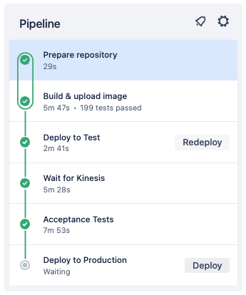
In my daily work, I strongly believe in the benefits of End-2-End tests. End-2-End tests give us the confidence that our system is working as in tended. Other than unit tests, they are black box tests running from outside against our deployed services. They are our final barrier before we deploy anything to production: if the End-2-End tests are green, we can hit the button.
Stability
Often times End-2-End tests are not as stable as unit tests. While the context of a unit test is very small and well-defined, End-2-End tests have many pitfalls.
- Is every service deployed with the expected version?
- Are there any changes to the infrastructure?
- Is there a lot of traffic or network issues on the environment?
- Are there timing issues such as race-conditions in the tests?
- Do we have any regressions?
- Do we have some actual bugs?
- Have the acceptance tests been update to reflect all recent changed?
To put it simply, a lot can go wrong. And to be honest, our End-2-End tests will fail at least once a day. For sure.
Visualizing the rate of failed tests
If a single End-2-End tests fails, that’s not a big deal for us. As I described above, there are a bunch of (good) reasons for this to happen. However, the overall rate of failing tests might be an indicator for issues such as underlying bugs or technical debt. But how can we visualize this failing rate?
Bitbucket REST-API
First of all, we must have access to our build results.
Let’s take Bitbucket as an example which offers a REST-API to do so.
The following GET request will query the first 100 build results from our pipeline.
It has five parameters which are important:
- (a) the name of the user / organisation / company
- (b) the name of the repository
- (c) the page to get (starting with 1)
- (d) the page length (max 100)
- (e) the trigger type
https://api.bitbucket.org/2.0/repositories/my-user-name/acceptance-test/pipelines/?page=1&pagelen=100&sort=-created_on&trigger_type=SCHEDULED
                                           |----------| |-------------|                 |         |-|                               |-------|
                                                a               b                       c          d                                    e
If you run the request, you will get a result like this. It contains everything we need to visualize our build results over time.
{
   "page":1,
   "pagelen":2,
   "values":[
      {
         "state":{
            "result":{
               "name":"SUCCESSFUL"
            }
         },
         "build_number":33308,
         "created_on":"2023-03-07T07:48:01.848598Z",
         "trigger":{
            "name":"SCHEDULE",
            "type":"pipeline_trigger_schedule"
         },
         "duration_in_seconds":390
      },
      {
         "state":{
            "result":{
               "name":"SUCCESSFUL"
            }
         },
         "build_number":33307,
         "created_on":"2023-03-07T06:48:00.912946Z",
         "trigger":{
            "name":"SCHEDULE",
            "type":"pipeline_trigger_schedule"
         },
         "duration_in_seconds":379
      }
   ]
}
Scripting to collect all build results
We can query the build results page by page with a max page length of 100. To get a huge number of build results, we can use some simple scripting. In Kotlin this could look like this:
// Authentication via Basic Auth header: user + app password
val headers = HttpHeaders().apply {
    val base = Base64.encodeBase64("$user:$appPassword".toByteArray())
    val asString = String(base)
    set("Authorization", "Basic $asString")
}

// Get page 1 to 3
val pagesWithPipelineRuns: List<JsonNode> = (1..3).map { page ->
    val uri = "https://api.bitbucket.org/2.0/repositories/$company/$repository/pipelines/?page=$page&pagelen=100&sort=-created_on&trigger_type=SCHEDULED"
    val result = restTemplate.exchange(uri, GET, HttpEntity<String>(headers), String::class.java)
    objectMapper.readTree(result.body).get("values")
}
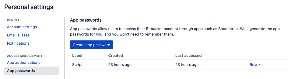
Authentication via Basic Auth
The authentication works with basic auth. However, you must create an app password in order to do so. Go to your personal settings in Bitbucket, click on “App passwords” and create a new one. You must use this password together with your username for Basic Auth.
Create a CSV file
At this point, we have a list of as many test results as we want. We can query page after page for the last couple of years. To plot the results we can map the JSON results to a simple CSV file.
First, we map the JSON from Bitbucket to a simple Kotlin data class. This makes it much easier for us to create the CSV.
val allPipelineResults = pagesWithPipelineRuns.flatMap { it.mapNotNull(::jsonToTestResult) }

fun jsonToTestResult(jsonOfTestResult: JsonNode): TestResults {
    val success = jsonOfTestResult.get("state").get("result").get("name").asText()
    return TestResults(
        build = jsonOfTestResult.get("build_number").asInt(),
        success = if (success == "SUCCESSFUL") 0 else 1,
        duration = jsonOfTestResult.get("duration_in_seconds").asInt(),
        createdOn = jsonOfTestResult.get("created_on").asText().asOffsetDateTime()
    )
}

data class TestResults(
    val build: Int,
    val success: Int,
    val duration: Int,
    val createdOn: OffsetDateTime
)
Now we can map all test results to a simple CSV file. Since there might be many test results, I decided to group all results by day and to take the average.
File("results.csv").printWriter().use { out ->
    allPipelineResults
        .distinct()
        .sortedBy { it.createdOn }
        .groupBy { it.createdOn.toLocalDate() } // group by day
        .forEach {
            val success = it.value.map { it.success }.average() // average per day
            out.println("${it.key};${success};") // e.g. 2023-03-06;0.452;
        }
}
The final CSV file could look like this:
2023-02-26;0.142;
2023-02-27;0.125;
2023-02-28;0.33;
2023-03-01;0.5;
2023-03-02;0.125;
2023-03-03;0.04166;
2023-03-04;0.0;
2023-03-05;0.0;
2023-03-06;0.0;
Plot with Google Sheets
We can plot the CSV file easily with Google Sheets. Create a new spreadsheet an import the CSV file.
Now you can mark both columns and insert a simple line chart. The plotting should work without any modifications out of the box. Just hit the button.
Interpreting the chart
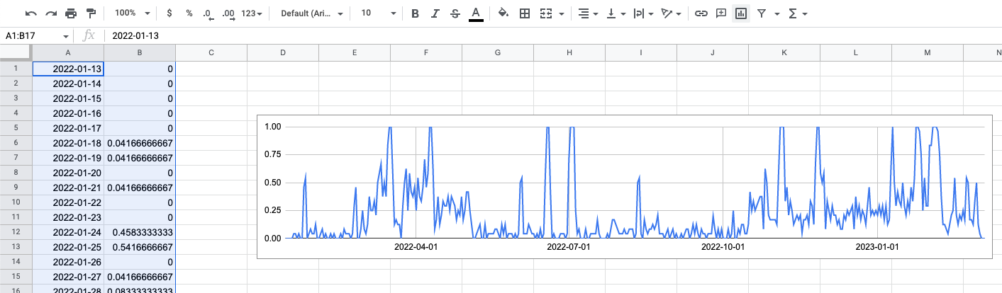
So what can we see with such a chart? Let’s take a look at a real life example from our team. The chart below shows the test results from one of our End-2-End tests for the last year. Starting at January 2022 until March 2023 (aka today).
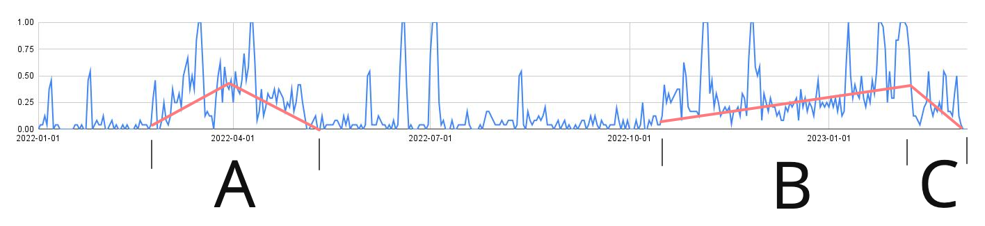
I’ve marked three sections in the chart which are interesting.
- (A) During this time we implemented a new search engine. This was a big topic and took several weeks until everything was working. You can see this very good in the chart. The error rate goes up as soon as the new project was startet. It drops only again weeks later when all issues have been fixed.
- (B) At the beginning of section B we started a big organisational change. We made new teams and changed our development process. This lead to an increase of technical dept for multiple weeks.
- (C) In section C we started to tackle this problem. We actively reduced technical debt and put our focus on bug-fixing. The rate of failing End-2-End tests dropped as a consequence.
As you can see, we can (try to) correlate the increase of the failure rate with some kind of events. This helps us to spot problematic features or changes we did in the past.
Summary
End-2-End tests are great and can give you much confidence in your system. But of course, they will fail from time to time for whatever reason. The rate of failure can be a good measurement for technical debt, underlying bugs or regressions. By visualizing this failure rate (for example by plotting test results) you can correlate it with events. Such events can be features or projects, but also other things such as organizational changes.
Best regards, Thomas.